My Scala Application: Real-time Twitter Volume Grapher For Indian Elections 2014
| Tweet |
The Indian general elections are around the corner. For software engineers, this time around, there is data to play with and try to predict the outcome. Among all, the data from the social media giants - Twitter and Facebook - is easily accessible for analysis. Though social media may not be the right barometer to judge voter sentiments in a country as big and diverse as India, it is nonetheless a very tempting datasource for anyone curious. So couple of days ago I decided to do a small project - to simply chart the volume of tweets with strings like “modi”, “rahul”, “kejri” and “india” in it. I thought just a graph of volumes by itself will be interesting to see. So here I present the v1.0 of my Indian-general-elections-social-media-tracker!
The Application
The application has 5 different dashboards with a URL for each. Each of these 5 dashboard’s have 4 graphs - one for each string (india/modi/rahul/kejri). Here is a quick summary of each dashboard -
3 Seconds Tweet Aggregate Grapher
- URL: http://bharathplays.herokuapp.com/twitter/elections/0
- Dashboard Sample Image:
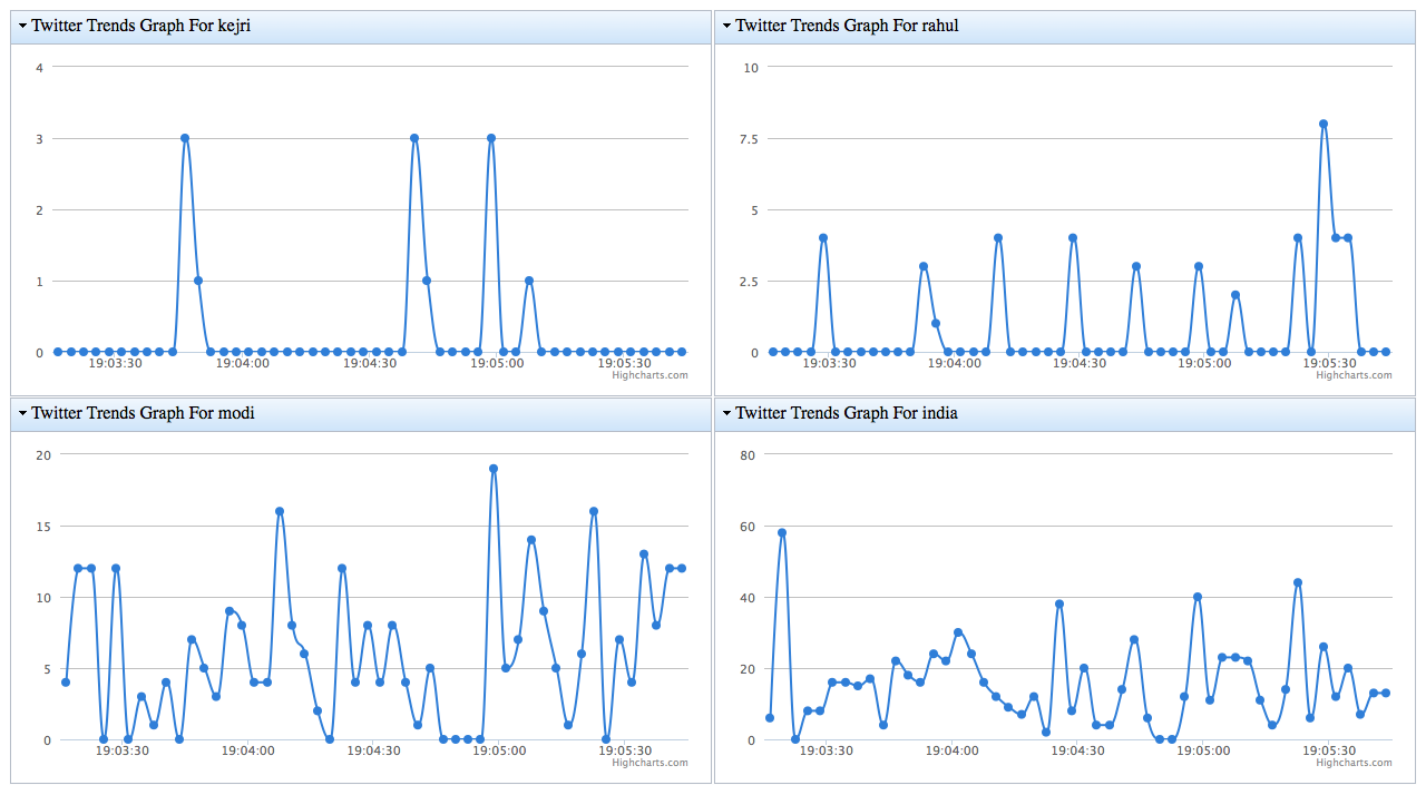
- Details:
- In this graph, a new data-point get created every 3-seconds. It appears as a dot on the chart. A mouse over of the dot shows the exact time and value of the data-point
- The title of the four grid’s shows the string the graph is for. For example, the title of the graph showing the line chart for string rahul has the title Twitter Trends Graph for rahul
- x-axis is time. y-axis is number-of-tweets
30 Seconds Tweet Aggregate Grapher
- URL: http://bharathplays.herokuapp.com/twitter/elections/1
- Dashboard Sample Image:
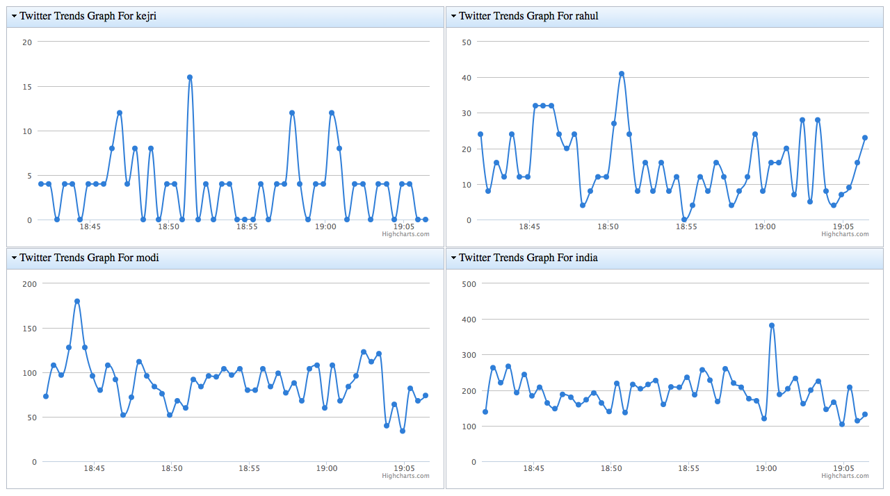
- Details:
- In this graph a new data-point gets created on the chart every 30 seconds
- Refer to the details of 3-seconds chart (above) for other info
5 Minutes Tweet Aggregate Grapher
- URL: http://bharathplays.herokuapp.com/twitter/elections/2
- Dashboard Sample Image:
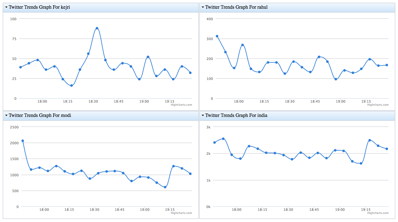
- Details:
- In this graph a new data-point gets created on the chart every 5 minutes (300 seconds)
- Refer to the details of 3-seconds chart (first one above) for other info
30 Minutes Tweet Aggregate Grapher
- URL: http://bharathplays.herokuapp.com/twitter/elections/3
- Dashboard Sample Image:
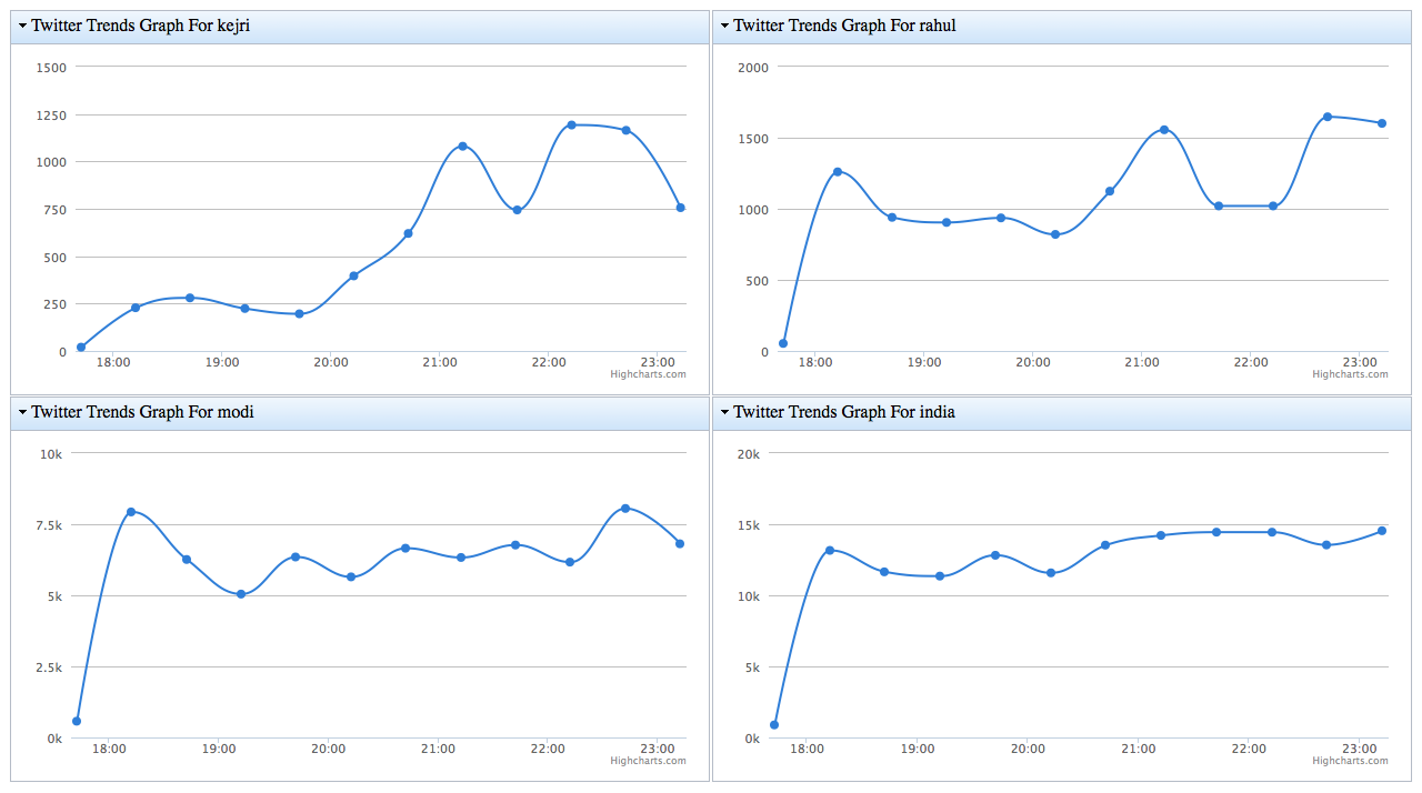
- Details:
- In this graph a new data-point gets created on the chart every 30 minutes (1800 seconds)
- Refer to the details of 3-seconds chart (first one above) for other info
3 Hours Tweet Aggregate Grapher
- URL: http://bharathplays.herokuapp.com/twitter/elections/4
- Dashboard Sample Image: [TBD]
- Details:
- In this graph a new data-point gets created on the chart every 3 hours (10800 seconds)
- Refer to the details of 3-seconds chart (first one above) for other info
Design, Code and Logic
- The code is on GitHub here
- It uses Play! Framework’s capabilities for all UI work which includes templates, URL-routing and WebSockets communication
- To bind to Twitter’s stream firehose it uses Spray.IO
- All the code is in Scala. It does not use threads and uses the actor-method of concurrency using Akka
- Play’s capability to do async websocket concurrent broadcast is leveraged
- It connects to filter API among the many Twitter’s streaming APIs
- The part of code which connects to Twitter’s streaming APIs and retrieves individual tweets is an extension of this example by Jan Machacek
- This application does NOT do sentiment analysis but is a brute-force volume grapher. So a higher count for a candidate does not imply positive popularity but just that his name is trending more.
- A keyword string, say Rahul, might appear anywhere in the tweet. That is, it could be anywhere in the text, or may be a part of the hashtag, or may even be part of a user handle that appears in the tweet
- While trying to find a match, I convert the whole tweet to lowercase and then use Java’s String contains() to find a match. So the matching is case insensitive - the count for string Rahul includes those for rahul, raHul, rahuL etc. The matching string could also be a substring. So modi will match modified, moditva, amodi, etc. However I took a dump of over 1000 tweets to see how many of those captured did NOT belong to Indian elections - only to find that almost 80% of all tweets captured did concern these candidates and hence elections (you have to take my word on that!)
- One of the main motivations behind the design is to keep it lightweight. Twitter data is voluminous as can be seen by the counts. So the challenge is to serve a huge number of web-clients along with processing the incoming data. By removing the HTTP request-response loop for each update of the graph, a potentially big saving is achieved. Further, data for all 4 graphs in the dashboard is multiplexed over a single WebSocket channel. So every browser client has a single WebSocket channel to the server. This again is a big saving, since, if AJAX were used, then to update each of the 4 graphs would have required one client-to-server call each - which is very very expensive as the number of browser-clients increase
- Actors are a beautiful message-passing abstraction which make erstwhile tasks like managing threads and pools redundant. Please refer to to Akka documentation to know about this paradigm of programming
- The whole application is hosted on Heroku. Heroku allows hosting of Play 2.0 applications and also provides WebSocket support. So the cost of running this application to me is free! :-)
The design flow essence is captured in this image -
WebSocket Addendum
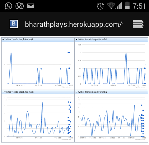
The graph may not appear if you are a behind a proxy which does not tunnel WebSockets (like behind some of the office networks). Also if a firewall blocks WebSockets. But in case you run into any of these issues, then you could use your mobile device to see the dashboard. Here is the screenshot from my Android Samsung S2 on my home Wifi. I also checked that the graphing works on my Airtel 2G network fairly well too (the dots in the image below are some mess-up by the mobile screenshot tool)
Final Note
These graphs are just volumetric. I plan do some simple sentiment analysis next. However, by looking at the graphs and tweets behind them, it is heartening to see the order of popularity of each string. India is most popular among the four but next comes Modi and it is generally not far behind. Rahul seems to appear more than Kejri but both these strings trail a long way behind Modi. With me being a diehard Sri Narendra Modi supporter, these graphs and numbers certainly make me happy and hopefully bode well for the good times to come for my country :-)
comments powered by Disqus

